Logo.
Making our mark.
The Dominus Real Estate logo is one of our most valuable corporate assets and uniquely distinguishing us from our competitors and other companies. It’s the tangible symbol of our brand, representing everything we are: our expertise, our values, our people, our offerings.
Core logo.
Our logos’ consistent, visible use reinforces the Dominus Real Estate brand, makes it more memorable and authenticates the things to which it’s applied. It’s an essential component and lends authority and engenders trust wherever it appears. It’s our responsibility to protect it.
The logo can be downloaded as a jpeg, png, svg and eps. Download the full suite below.
Our brandmark evolution.
Using the masterbrand macron as a starting point, we’ve created an icon which encapsulates the ideas of journey, progress and entrepreneurialism. We’ve retained the power of our masterbrand by leveraging the strength of a diacritic mark to emphasise the ‘us’ in Dominus.
The arrows work to reveal a focal square space which speaks to the brand’s ability to identify and unlock potential and create opportunity. By positioning the icon In this way, we draw on the ideology of the North Star with its powerful symbolism as a navigation tool and a sign of growth and progress.
Our Guiding Star.
Our Real Estate brand follows in the steps of our corporate brand, using an accented mark above the ‘us’ in Dominus. Using the original brand arrows as a starting point, we’ve created a guiding star icon which encapsulates the ideas of journey, progress and entrepreneurialism.
It should not be used as a brandmark in its own right, except where space dictates that the full brandmark is not possible. It can be used in conjunction with the main brandmark as a graphic tool.

Legal requirements.
Coming soon.
Usage.
The Dominus Real Estate logo should appear on every piece of official Dominus Real Estate communication. On printed literature, it generally appears on the front cover, back cover or both. In videos, it generally appears at the end as a final sign off.
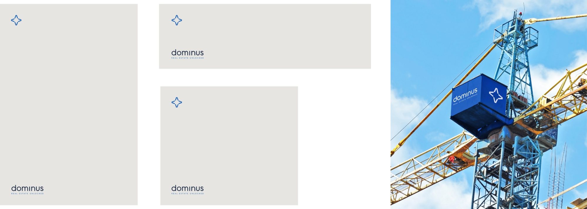
Our distinctive elements of our Real Estate brand allow us to be flexible with the logo lockup, repositioning the star and/or strapline as the environment dictates.
Dynamic layouts such as those shown below allow us to nest key content between the elements of our brandmark.
This should always be done in a way which maximises the visibility of the brand, in consultation with our brand guardians.
Colour.
The logo should only be used in the colourways shown below.


Clear space.
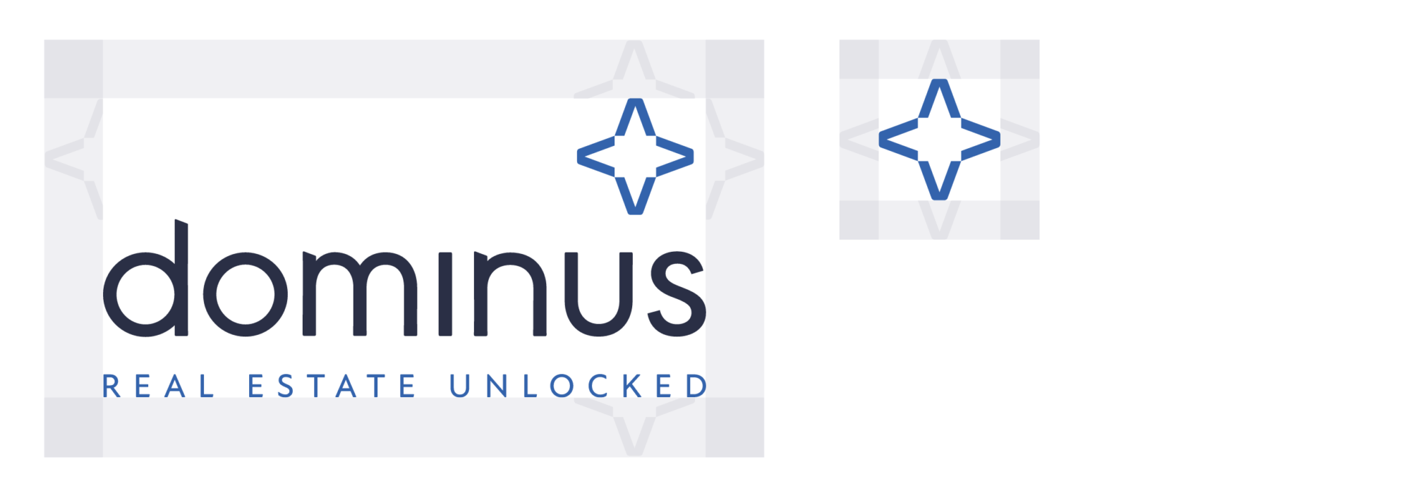
An exclusion zone is necessary to protect the integrity of the brandmark. This clear space creates a protective area to help it stand out and remain consistent.
To ensure maximum clarity, we use 1/2 height of the star as the minimum space around the brandmark. Our star icon should have a minimum exclusion zone of one arrow height.
Alignment.
The Dominus Real Estate logo can be either left or right aligned. The Dominus logo should sit on the opposite axis to the main content of information. This is to ensure the Dominus logo remains prominent and does not compete with other elements on the page.
Minimum sizing.
In instances where brandmark must appear smaller than 32MM, use the secondary brandmark.
Logo and photography.
The logo should be carefully placed on photography. Always place the logo on clear and simple backgrounds with plenty of contrast for legibility. Avoid placing the logo on busy or complex backgrounds or images to keep it as legible as possible.
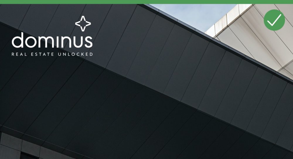
Always place the logo on clear and simple backgrounds.
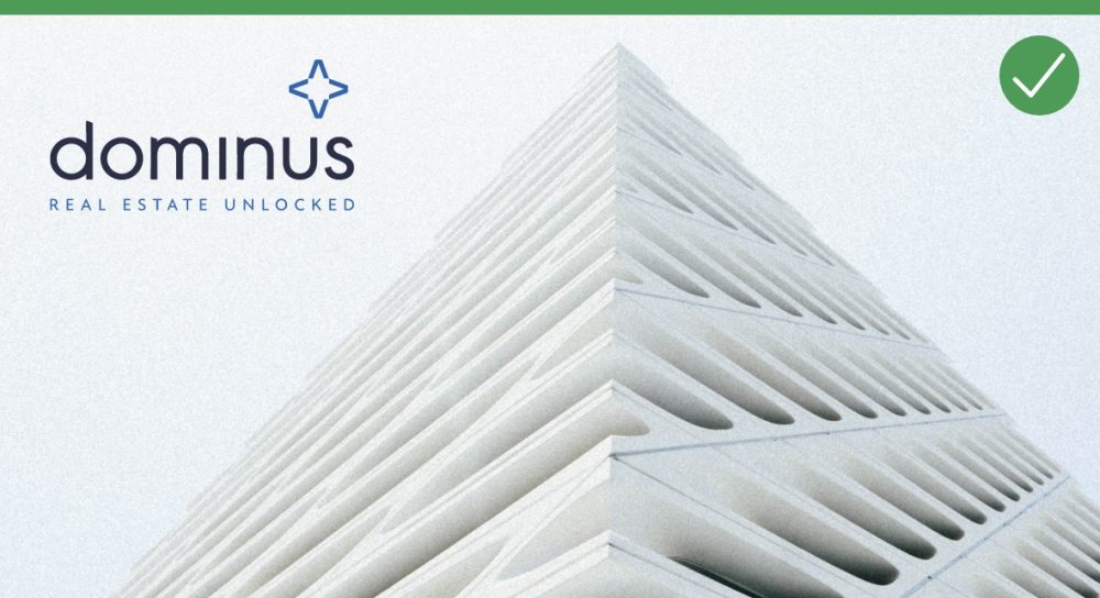
Always place the logo on backgrounds with plenty of contrast for legibility.
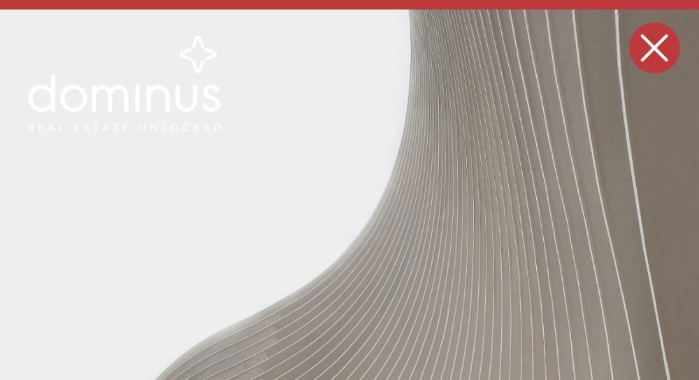
Never place the logo on images that don’t provide enough contrast.
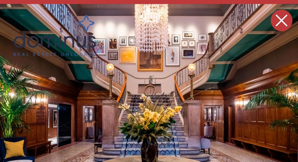
Never place the logo on busy or complex backgrounds.
