Our primary brand font is Visby CF, a geometric and humanist font that has been selected for its accessibility and warmth. This typeface should be used in print and digital applications wherever available.
! Please be aware that Visby CF is a licensed font. Make sure that if you install it on your device or if you use it for online publication, you have the corresponding license agreements.
To download Visby CF font: https://connary.com/visby.html
Where it is not possible to use our primary brand font, we should use Century Gothic.
Good typography often goes unnoticed because it just makes sense. Elements of good typography include consistency, hierarchy, and alignment.
Examples of how to differentiate titles and subtitles by weight or contrast change are shown here. It’s important to keep it simple and not create titles that are too long.
All headlines must have a full stop at the end.
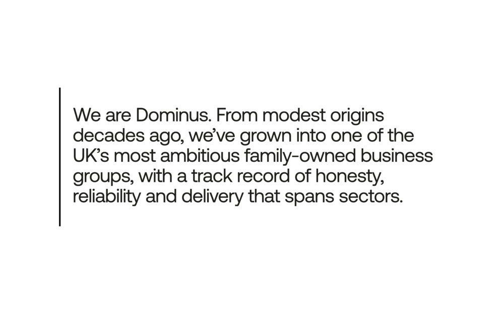
Flush left creates strong alignments for the eye to follow, aiding readability and organisation. It is our standard for all typography across Dominus because it is functional, modern, timeless, and the most effective in information design and legibility.